I talk a lot with other writers, both online and in real life (because that’s where the beer is!) about what makes an e-book sell. After all these discussions and head-scratching, I’ve come up with one simple, unquestionable answer.
We have no frickin’ idea.
I don’t have any idea what makes a book take off, while better books languish. I have no idea if it’s a cover thing, a blurb thing, or a marketing thing. But I do know a few things that will contribute to good sales, and in this series of posts I’m going to share what I think I know with you. But first, a disclaimer: this works for me, today. It may not work for you, and nothing I say may have any validity six months from now. The world is changing rapidly, and anybody that tells you they know exactly what is going to be happening in publishing a year from now is either a liar or an idiot, and you’re probably well-served to run away from them.
But we’re going to start with two things that I know are important – covers and blurbs.
That old saying “you can’t judge a book by its cover” is very nice when talking about things other than books, but the fundamental truth is that we can, and do judge books by their covers all the time. The cover is one of the most important things about a books, and that’s why a lot of really good writers spend a lot of time agonizing over their covers.
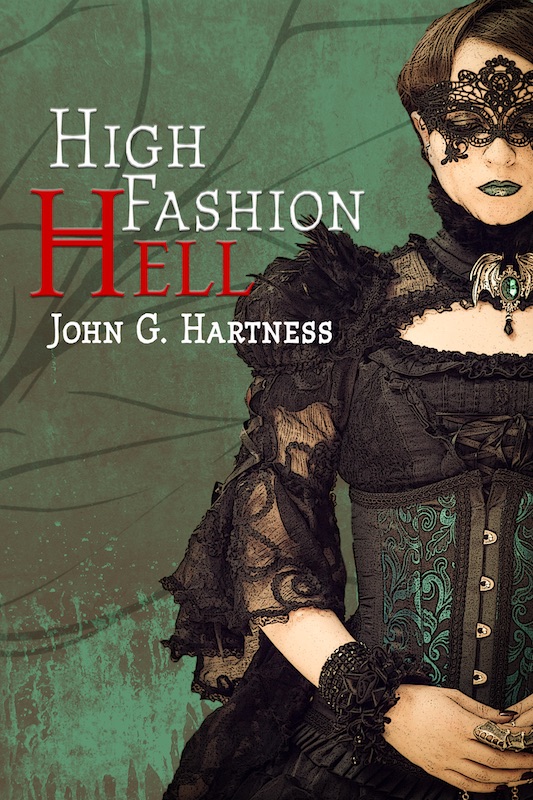
It’s also not something I’m very good at. Frankly, I love the covers of my first two books, but they do absolutely nothing to tell you what the books are about. As much as the cover of The Chosen is exactly what I had in my head when I got started working with my artist, it says nothing about angels, devils, immortals or saving the world. And Hard Day’s Knight is no better.
Don’t get me wrong, I think the HDK cover is beautiful, but look over at the sidebar and tell me that it says anything about funny vampires to you. Yeah, me neither. So I have cover issues, and I really didn’t come to that realization until this weekend at the HeroesCon, where I realized that people would glance at my covers, the covers didn’t speak to them, and they’d move right on. So at some point I’ll redo all the covers. Right now, I have good enough blurbs to get my sales cooking online, and online is where most of my sales come from, so I’m not going to spend the cash right now. But at some point by the end of the year, I’ll redo all the covers. I want a unified theme for all the Black Knight Chronicles books, and I want The Chosen to have a more fantastical feel.
So there’s one thing about covers – they need to reflect what your book is about, at least on some level. Here’s a better cover example, but one that still has a couple of issues in today’s market.Another thing that some folks miss when designing covers is the fact that they don’t just need to look good in mass market paperback size, they need to look good in the thumbnail, too.
Without picking on anyone’s covers, there are few things I notice with covers that take away from the impact.
1) Author’s name – it’s either too small to be legible, too big for the layout of the page, or the color of the lettering makes it impossible to read online.
2) Text – there seems to be a race to find our just how many blurbs, quotes and stats can fit on a cover nowadays. They’re almost always impossible to read online, so strip them off the file! If it’s fuzzy or illegible, cut it out! Move all that information to the blurb, where you have plenty of room to write all that stuff.
3) Overused royalty-free images. This is kinda limited to self-pubbed and small press books, but I’m tired of seeing the same chick looking through her hair at me from the cover of a book. There are a bunch of images out there, please at least look through YOUR GENRE bestsellers before using one that has been used a couple dozen times.
I’m out of space, so next time we’ll talk about blurbs. Leave your favorite cover gaffes in the comments.

This is good stuff, John. I read Hard Day’s Knight recently and enjoyed it. Well done!
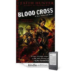
But I will agree that the cover is not what is selling it. The cover is actually cool, from an artistic standpoint, but particularly on Kindle, you need to replace it.
In the Kindle thumbnail when you search the store, nothing is readable on the cover, not even the title. You can’t begin to tell what the objects are on the cover.
The slightly larger thumbnail on the detail page is not much better. You can make out the title, but you’d only be able to recognize the cityscape if you knew that’s what you were looking at.
Finally, even on the full-page rendering of the cover, the lack of contrast in the image makes it difficult to make sense of it. I can barely read your name, but the title and series bar stand out well enough.
Anyway, I’m not trying to pick on your cover. I’m just pointing out something everyone should keep in mind: how does the cover look in BLACK AND WHITE at various sizes?
Hopefully, all reading devices will be color some day and it won’t matter as much, but looking at your cover as a greyscale image may help you identify elements that could be improved, even for the color version.
The other thing to keep in mind, and maybe you’ll talk about this in a later post, is that cover layout (including the size of the author’s name) is genre-specific. There is no one-size-fits-all solution. Check out the designs of the top sellers *in your genre* to get layout ideas (and your point about avoiding overused stock images is great).
Hi John,
Interesting blog about cover design. I just finished the artwork for the cover of my new book, Arboregal. I started the artwork as a thumbnail size, and only after I was satisfied with it, I painted in full size. If it looks good in miniature it will look good in full size. Since on Amazon the book covers appear in post stamp sizes it is essential to grab the readers’ attention with an appealing design.