So if you watch my Facebook page (and really, you don’t? How dare you actually have other people you might be interested in!) you’ve seen the new covers for the Black Knight Chronicles Books. If you don’t, here they are.


These were all created by the grossly talented Carl Graves at Extended Imagery, and I couldn’t be happier with them. Carl was exceptionally professional, and the end results are amazing.
But why did I redo covers on two books that were selling pretty well?
I’m glad you asked, even if I did have to prompt you. When I did the Heroes Con in June, I had print copies of all my books out on the table. As people would walk by, if they looked like my target demographic, I’d try to hand them a postcard.
Sometimes this went well, sometimes not. But nobody punched me, so in the end it was okay.
But once thing I realized is that people were more likely to pick up Back in Black than Hard Day’s Knight, and I didn’t really understand why. Then I took a good look at the covers.
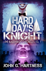
 This is the original cover for Hard Day’s Knight. It’s a very nice cover, looks great in print, and is EXACTLY what I asked my designer to provide for me. Right down to which side of the building the moon is on.
But it says nothing about vampires, or horror, or supernatural beasties. And if you’re writing a book about supernatural beasties, and you’re going to steal a Beatles song for the title, you need to give a reader a clue what the book is about. And this cover does not do that. At all. So people who might buy a book just because there’s a cool monster on the cover, will be passing this one right on by.
The cover for Back in Black was better, but as time went on I became less enamored with the 3d troll I had on the cover. It all started to look more like a video game box than a book cover to me, so when Knight Moves was ready to go, I contacted Carl and we re-did the first two books while we were working on the third one. I’m exceptionally happy with how they turned out, and the titles and my name are now legible in a much smaller size, so they can be read in a thumbnail on the Amazon or Barnes & Noble site. And that’s really important. Especially the name thing. Because people buy books from people they’ve read before, and name recognition is immensely valuable in this business.
So that’s why I redid the covers for my best-selling books, to try to grab all the market share I could! And something is helping, because this has been an awesome sale week! Knight Moves is outselling Hard Day’s Knight at times, and that’s awesome! The book will break 500 total sales this weekend, making it my fastest to that number by a long mile. If things keep going, we’ll hit another record month, which is good, because after buying three new book covers, Daddy’s got a credit card to pay off!
Y’all have a good weekend, I’ll be sleeping late, performing The Irish Curse at night, and drinking too much.
On a serious note – my heart and prayers go out to those injured and killed in the collapse of stages at the Sugarland show and the Belgian Pop Festival. I don’t have any good words except to say that I hope my industry will band together and do everything we know how to do to make sure this NEVER happens again. These were preventable tragedies – NEVER AGAIN.

I’m torn on the new covers. Part of me really likes them, it gives the books a cohesiveness – in the covers I mean. The other part of me, though, is afraid they’ll make people think it’s a comedy series or something.
I’m guessing that’s the point of the split cover…. it’s like a mullet. All business in the front and party in the back. >_> NO, no. Seriously. The top half of the cover illustrates the quirkiness of the characters while the bottom half shows the villain and seriousness. It’s an interesting concept and now that I think about it, I really like it.
I don’t know, in the end I do think this will help the series more. Like I said, it really does show a cohesiveness in the series which’ll probably be a good selling point.
Oh, one last thing, I really love the font for the titles. It’s absolutely perfect.
Would you like for these to be the covers people see when they search for your books on Goodreads? I’m not sure if you care all that much, but I can change that on there.
Yeah, I’d love for these to be the covers on GoodReads. Thanks!
The two things I was going for was a cohesive look across all the books and some indication that it was a horror/fantasy novel. So I’m really happy with the end results.
Someone else on the site did a bit of work too, but when you search for “Black Knight Chronicles” on Goodreads your works come up and the new covers show!
The more I see these covers, the more I love them.
Hey John! We met yesterday at Dragon*Con during the panel for self-published vs. traditional publishing. I totally get where you’re coming from with your book covers, and I could have REALLY long discussion about my own for the same reason. My ISLAND OF FOG cover seems like a nice, mysterious, atmospheric image, but it doesn’t speak to younger readers at all. Where are the monsters? Okay, so I could argue that there’s some mystery involved and the characters don’t know about the monsters right away… but still, it needs monsters on the cover.
My second, third and fourth books have a monster of some kind and they do seem to draw the younger readers. But honestly, it’s the fourth cover that works best — LAKE OF SPIRITS has a “creature” that is weird enough for younger readers and, um, intriguing enough for older readers. 😉
But in any case, your new covers are great, and if I may say, a big improvement (that’s meant as a compliment!!). Another thing that doesn’t work with the original HARD DAY’S KNIGHT cover is the cutesy title font. It doesn’t scream horror, comedic or otherwise. Then again, what do I know? Look at Charlaine Harris’ covers… They’re bloody awful and that didn’t stop them selling! They have vampires on them, but the books look like they’re aimed at 12-year-olds.
Oh well. Good to meet you, and maybe we can talk about this chapter swapping idea? I’m intrigued. 🙂