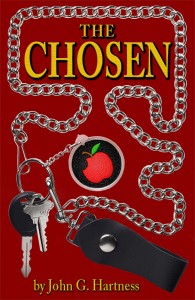
So I’m working on a redesign of the cover for The Chosen. I think the cover I have is okay, but similar to the old covers for the Black Knight books, it doesn’t really tell a prospective reader what the book is about. So for those of you out there who have read the book, what images do you associate with it? What kinds of things do you think would make a good cover? I can’t offer much for your help (unless you want to design the cover for me, in which case let’s talk money), but you’ll have my undying gratitude.
Here’s what I have – 
Pros – The title font is good, and it’s BIG. That needs to stay. It’s a striking color combination, the red background with the yellow letters. I like that and think it grabs the eye.
Cons – It says nothing about angels, devils, Adam, Eve, fantasy literature or anything like that. Angel fiction is very marketable, and obviously fantasy lit is as well, but nobody looking at this cover would have any idea what the book is about. That needs to change.
So help me out here, folks. Let me know what the book says to you – what images stick with you from the book?
Someday I’ll get back to actually, you know, writing again, but I’ve got a bunch of stuff going on trying to maximize my promotional stuff right now. I hope to have the second draft of Return to Eden:Genesis done by October 1. Especially since I just booked another design gig that’s going to lock up most of my free time in October, so if that book stands a prayer of getting out this year, I’d better step on it.

Image in my head goes something like this:
Adam from the back, either straddling or standing aside the bike, under a wilting Tree of Knowledge with either a dead apple hanging from it, or a bitten apple on the ground.
Work in Michael and Lucky subtly. Either have the ol’ serpent in the tree (driving home more of what it’s about without giving away anything), or have both Lucky and Michael in the distance a bit, not the focus, but there to be seen. A subtle wing or halo or the like to suggest what Michael is.
OR, have them in the distance still, but position to SUGGEST (not appear) being on either shoulder/side of Adam.
You could drop Adam entirely, have him be represented by the bike, and have Lucky and Michael (it was Michael, right? Been awhile since I’ve read it) on either side of it. Less obvious, still drives home the basic idea (Devil, Angel, Adam & Eve via the tree, in modern times).
One more thing – if you want to keep the red background, work it into the sky. A sunrise/set can provide the colours needed.
The apple is what is wrong. I get it but it makes it look like a computer story.
There is an old master (no copyright) of Adam and Eve by the Tree of knowledge facing the camera. Stick that in and make the edge of the fob a leering snake.
The big thing that I would like to see represented [but would probably be hard to do] is choice. I have no idea how you’d do that, but… it would be neat. A gold circlet in one hand and an apple in the other? Not completely obvious, but once you read the book you’ll understand it. Now, how the character would be positioned on the cover and all that jazz and what the background would be… I have no idea. Just the idea of Adam holding those two things is kinda intriguing.
Oh, actually on the background… it’d be kind of neat to show a city scene, but have it mirrored to show the normal every day version and the other one a pristine, perfect version that’s devoid of any chaos. You’ll be spilling the ending, but the new reader won’t know!
It’d take some skill to actually make my idea work and not look terrible though. >_<
Here’s one reason sales may be slow in S.C:
http://reason.com/archives/2011/08/25/reading-is-fundamentally-banne